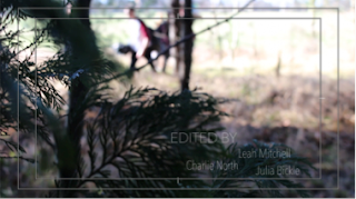
We have decided to overlap our titles over our footage; it creates a more interesting visual. In order to achieve the best titles suited for our film opening, we will need to consider the titles fonts, sizes and placement.
 Font: Chalkdust
I think that this font isn't suitable for our titles because it looks tacky and slightly childish - it doesn't give off a professional vibe.

Font: Chalkdust
I decided to use the same font but experiment with the sizes and placement of the titles. By doing this, I have realised that I want the titles to remain straight (not slanted) and for sizes to be the same.

Font: Avenir Narrow
In comparison to the previous font, chalkdust, these titles look a lot more professional although they lack visibility.
Font: Avenir
This is the same font however I have adjusted the boldness of the letters so that they are readable. I like this font but I think it looks extremely bland.

Font: Courier New
I selected this font as it matches the newspaper at the beginning of the opening scene; it seems like an old-fashioned newspaper - it doesn't stand out though.
Font: Courier New
I have made our names bolder to make them the focus point - but this then makes the actual title not as visible.

Font: Courier New
I have made the title 'Edited By' bolder instead so the audience know what we've done, however now our names aren't as clear.
Font: Courier New
By making the entire title bold, it ensures that the audience can clearly read them. I then experimented with the placement of the titles. In this case, the titles cannot cover the lighter area due to the white font which blends in with the background.
 Font: Courier New
I then moved the titles into a darker area so the text had a large contrast against the background therefore becoming easily readable.
The Main Title
For our main title, we have decided to have a font which features the theme of the woods within it in order to emphasise the significance of the woods.
OPTION 1 - This font is striking and bold however I don't think it fits with the genre of film; it
looks more fitting for a light-hearted film rather than a horror.
OPTION 2 - The twisting branches within this font helps convey the eerie nature of the film.
As well as this the font is extremely bold and would stand out.
OPTION 3 - Although this font incorporates the mysterious factor into the opening scene, it
may not stand out against the background due to the white lines overlapping
black letters.
OPTION 4 - The font, though it is of a wooden theme, looks more like planks which doesn't
express the ideology of a creepy forest. It also isn't as distinct compared to
other fonts because white is the prominent colour.


No comments:
Post a Comment